Saturday, October 29, 2011

Orange Bike Gets Turned On It's Side

Here is  another painting that was going in an unknown direction.  I started with a bicycle and a couple of crows.  I wrote in my last posting that I was going for a new approach to composition and a looser paint style.  Add to that spontaneity.  Everyone likes spontaneity,  don't they..?
PHASE ONE One bicycle and two crows.  This was a good start, but after this things got a bit muddy and I put it aside for a few days.
PHASE THREE  I got rid of the crows, added another bike, and I did something I never did before,   I turned the painting on it's side.  Things started to get interesting.   Sometimes you need to change your perspective.
PHASE FOUR I added some nice harvest yellow.  It is actually a drop of Old Holland paint.  It's a premium paint that cost, depending on the color and average of $13-$89 for 1.25 oz.  It is uber paint.  It over powered the whole color scheme.  It looks like a beacon in the upper middle area. 
PHASE FIVE I scraped the whole thing off.  The colors from the layers below surfaced, quite nicely.
FINISHED  FOR NOW  I hung it back in the original horizontal direction.  It is pretty loose, which is what I was aiming for. I really let go with the composition by turning it on it's side for a while.   I think that Phases three, four, and five look pretty good here, but in person this one is the best...for now.


Saturday, October 22, 2011

Death of a Seagull Experimentation part four (Here I go again)

I may be changing the title to something to do with "Scooter"  not "Seagull" soon. My friend Scott Inguito suggested getting rid of the seagull, then I could keep my kooky, beloved shape!  I bridled at first then immediately realized he was probably right.  As is, the painting is not resolved.  I love the seagull, but that  probably is the problem.  He might have to go.  I can always use him again.  In any case, I have gotten very fast at rendering him.
This is how I got here...  All this experimenting I've been doing this lately has given me the courage to pick up the Seagull again.  I started by I touching up the bird for like, the 11th time, actually I just checked, it's the 13th time.  I thought about putting the "45th Avenue" in the composition but then I thought that would be a cheap trick.  I use imagery over and over all the time, but I'm not sure I can do that with such a distinctive sign/symbol.  So I put in a scooter. Are you getting the picture that these things don't always make sense at the time?
I had put a blue and a red glaze over the whole thing a week ago.  Today I added thick white and gray paint and goopy white and gray paint.  The red and blue still shows through in places.  I integrated the surface with my palette knife and manipulated the drips a bit.  I painted the white around the body of the seagull, leaving a layer of old painting  to show through his silhouette.
Argh! This is what happens when you don't plan.  I added this nice brushy gray to help balance the composition, then decided to make it drip right into the seagull and the scooter.   I like what it is doing, but I  will have to paint everything AGAIN.  It is the story of of this painting.  I think I will call it "15 Seagulls", whether there ends up being a seagull in it or not. 


Thursday, October 20, 2011

4 New Paintings Started PAINTING FOUR


The Semi

I don't know about other painters, but sometimes I start a painting and I know almost exactly where it is going and it feels like a slam dunk..  Sometimes I only have a vague idea of where I am going.  There are only a couple of things I am aware of that I want to accomplish, and then there are those paintings where I have no idea where they are going.  The last kind are not so good. They can take forever to figure out (some up to a year) though they can turn out grand.  This one was only vague.  Also, I must admit, I hardly ever know what I was thinking until the damn thing is finished.  Then it all comes clear... usually. 
So finishing this painting I figured out what  I was trying do in the last three paintings.  First, I want to compose things to look more "collaged".  By that I mean that I want them to have a more adventurous composition, not only logical or natural, with the usual things up and the usual things down. Second, is the thing I have been working toward since "Tanker", loosening up my paint and being more spontaneous. 

   There he is the Elmo! ( I almost left him scratchy with highlights created by scraping way the dark paint to reveal the orange color beneath.  Of course I couldn't, maybe someday.)  On the dots, I am drawn to these flat shapes.  I'll call it my "Decal Phase".

Elmo blurred.

 Maybe it's just me, but this painting feels large.  Perhaps it's the semi in the background that makes this painting feel bigger than it is.   It is only 12"x12".  It is still in flux.  I thought it was finished, but I am going to take out the white cube.  I put the cube in because I wanted a drawing/line element for some weight variation, and I thought it might anchor Elmo, but it isn't working.   Live and learn, that's what it's about.

I toned down the decal
I want to still call this "SEMI" and put it in the "Highway 5" section, but Elmo seems most prominent now.  Maybe this painting should go in the "Beasts" section?   12"x12" oil on panel

Tuesday, October 18, 2011

4 New Paintings Started PAINTING THREE

We have new neighbors, because our beloved old neighbors, Joshua and Sabrina , moved to a house in the Excelsior.  Sabrina is a wonderfully creative cook and food blogger (http://www.thetomatotart.com/) and she wanted a garden and more room to entertain.  The new neighbors are very frowny and sad.  Tom, my boyfriend and my daughter Makiko call the new folks the "unhappy hipsters".  They have many tattoos, chihuahuas as well as nice vehicles.  The vehicles are a good source of imagery for my paintings.  I can be found out there at any given time surreptitiously shooting pictures of their shiny motorcycles and bikes.

Once again I am taking out the cubes, so don't get attached.  (Fourth image)

The second image was the first rendering of the motorcycle.  I show it only as a memorial, because it doesn't exist anymore.  It came to a grisly end.  I sprayed on some soap to try and get some drippy variation in the white background.  The motorcycle was not dry enough and the soap melted it right before my eyes as I stood helplessly by.  It was HORRIBLE. 
sketch 8"x8"

This is the motorcycle that melted in the terrible "soap incident", as it was last seen.

Re-painted the motorcycle.  It i s a little more gestural than the first one.  I can never do something again exactly the same.  I can do it better and faster, but I think in this case, this one is just different.  The background is better!

It is almost finished.  Have to delete the cubes. 
Here it is finished.

Sunday, October 16, 2011

4 New Paintings Started PAINTING TWO revised

I skipped "The Bad Seed" showing at the Castro last night.  Instead Elmo and I went to the studio after work because I decided to get rid of the cubes in my new paintings. I was trying to get to them before they got too dry. I ended up having to scrape them a bit but the effects are actually pretty cool.  Anyway, as usual I digress.  This post is a amendment to yesterdays post of the black licorice bike.  I changed a few things.  Can you see the changes?
I added some highlights in the bike, a suggestion made  by Jhina Alvarado
.  Also I noticed some other minor gouges in the paint. I think something happened when I was away.  So I added more paint. 

Saturday, October 15, 2011

4 New Paintings Started PAINTING TWO

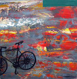
This is an experimental abstract painting I started a few weeks ago.  I knew it was not quite resolved for me so I added a couple of elements.  I think its finished.

Bicycle silhouette looks like it's made of black licorice, yum.

The rectangle in the corner is a balancing element, but in person it, really sings against the movement and warmth of the background.  The green paint is from one of my last four tubes of Old Holland paint I have from over 15 years ago.  I use  it very judiciously, but oh my word, that paint is wonderful.  I guess that's why it is is $30 a tube.  Other paint is like frosting, O.H. is like flesh. It sounds gross but it is sublime.

Friday, October 14, 2011

4 New Paintings Started PAINTING ONE

I had a busy week, in spite of all the stuff blooming and wreaking havoc on my sinuses. We are having our Indian summer here in the Bay Area. It goes like this; humid, then rainy, then hot, then humid, rainy and hot. It's like Hawaii over here, except instead of Plumeria we have mold. Anyway, here are the beginning stages of the 4 paintings I started this week, continuing the vehicle series.

Painting 1
BLUE BIKE sketch (temporary name) 8"x8"

BLUE BIKE 3

 
BLUE BIKE 4


BLUE BIKE 5 (It might be finished.  I will have to come up with a name, any ideas?

Thursday, October 13, 2011

Seagull Experimentation part 3 (I give, for now)

Ok, I am giving up for now on the gull.  I have four other paintings I started this week.  I am into vehicles right now.  I have started a semi truck painting, two bikes and a motorcycle painting.  Maybe I can put a motor on this bird and still make it fly later on, we'll see.

Unfinished Seagull Experiment 20"x20" oil on panel. 

Tuesday, October 11, 2011

Great Highway 2 Cars Finally Finished

This is the third to last version.  I kept re-painting the sky.
 Ever think something is finished and then you come back the next day and it's not?  Well that is what kept happening with this Great Highway painting. So here are the last two manifestations of this painting and the final finished piece.  I don't think you can really see much change in the digital image.  It is much more apparent in person.   I am changing the name by the way to "Great Highway Race".  I think the cars are racing each other. 

Second to last

 In person, the final painting has a sky full of different colors, and is a lot lighter in value.  I used my new, huge ( about 10") palette knife to to keep the surface really smooth, like a stone.  The change to a lighter value  and the added color opened up the sky and created more complexity.  


This is the final version.  GREAT HIGHWAY RACE 30"x40" oil on canvas. 

Friday, October 7, 2011

Seagull Experimentation part 2

 Those of you that have been following this blog will remember these famous last words on seagull experiment.  I wanted to,”…combine my current favorite elements, brushy paint strokes, a rendered beast, and some flat abstract shapes.”  That’s all!  No big deal.  All I have to say now is phht!
It started out ok, I got the shapes.  

 It took me all day to figure out how to tape off and paint really clean shapes on a super textured background.  I did it too.  People actually thought they were collaged on there.  I put shapes in.  I took shapes out. 

I showed it to my friends.  They hated the shapes.  I explained that I was trying to create space with the shapes, and that it was an experiment.   This seemed to make them like the shapes a bit better.  So much for being an aesthetic or perceived painter.  This painting was requiring words for validation.  Not a good sign in my book.  I liked the seagull, the background, the pink shape, and the gray shape in the foreground, but I knew it wasn’t working.  I showed it to many of my studio mates until, finally, Scott Inguito said what any self-respecting art critic would say at this point, “Paint out all your favorite things.  They are holding you back”.  I hate when people say that…grrr.  But I knew he was right.  I had said it a million times myself.  So what did I do?  I disregarded Scott’s advice and made a last ditch effort to save all my favorite stuff.  I was worried that if I painted the good stuff out, there would not be anything left.  I was going to be starting over anyway, so why not try to cheat painting death?  I figured I could block stuff out, but still keep parts of my favorite things.  So I took a tar like black and edited out a lot of stuff.  It looked like the seagull had been caught up in the Exxon Valdes oil spill.   

I used soap to dissolve the heavy paint and get some drips.  So the experiment continues…


Tuesday, October 4, 2011

Mexico House


I used to have a habit of working in “Monet-like series”.    As Monet had his penchant for haystacks and cathedrals, I had a thing for palm trees and running figures.  In watercolor I did a series of Long Beach palm trees in different color families, warm colors, secondary colors, or in different values, capturing the light at all different times of the day, just like Monet did.    I did a series in oil paint of a girl on a wire (It was called “The Pedestrian” named for the woman that ran out from behind a MUNI bus and across the double yellow line into my windshield one night on Mission St), I have her driving a "wheel" like gadget to symbolize her mendacity when she was clearly not in control.  I was always experimenting with different techniques and styles on the same subject.  It was really fun.
MEXICO HOUSE oil on canvas 10"x14" 1998
Well about 10 years ago  a painting called "Mexico House".  It was this humorous image of a house with an exaggerated antenna on the roof top.  The house rested behind a red brick wall and had inviting, glowing, windows and a warm yellowy patina to its walls.  I was trying to conjure the most inviting looking house without turning it into a Thomas Kinkade painting.  (No offense Thomas Kinkade fans, the man has skills)  The brick wall felt like a paradoxical element, which in a way seem meant to keep the viewer out, and/or is protecting the scene behind it.  Sticking out from the roof is this ridiculously tall TV antenna, which only people of a certain age will recognize in this day of cable and online video streaming.  I don’t know exactly why, but it brought to mind my idea of a fantasy house in Mexico, all simple, cozy, and family feeling, nestled in a wooded field, all alone and kind of rustic, yet totally plugged in to mainstream pop culture with a custom homemade TV antenna so they could get the fights or something.  The wall I think is protective and symbolized their separateness from their big neighbor the United States.

I really love the image and yet, when I first came up with this image, I did only two, a 10”x14” painting and a 4”x5” painting.  I have finally, after 10 years sold them both!  My friends Missy Feigum http://missyfeigum.com and Mike Stache are getting married and they liked the image so I recently painted one that is 8”x8” as a present for their nuptials. I am also making another larger one that is 16”x24”.  With this image I am going back to painting things from my head and not from observation.  Here is how it looks so far…
MEXICO HOUSE one  (Bricks on wall are huge)
MEXICO HOUSE two (Looks pretty good, but...)

MEXICO HOUSE 3 (Decided to make the antenna longer, so house had to move down a bit and shortened wall.) 
MEXICO HOUSE 4 (Positioning is better)
MEXICO HOUSE 5 (Finished, just need to wait for all that white paint to dry so I can put on the blue glaze.)
Ta-da, ok it has a terrible hot spot on the bottom left corner, but the painting is good.