Friday, September 30, 2011

I am playing with Abstraction

I am trying to get ready for our second Open Studios.  Art Explosion had one two weeks ago and now ArtSpan is having another this weekend.

 I have about four paintings going in my studio right now and three are on the brink of  being finished and this one I just completed yesterday, just in time for Fall Open Studios, which starts tomorrow.  Here are the three stages of this painting I am calling "Sideswiped".  It reminds me of the side of a car that has been careening down a city street sideswiping parked cars.  The passenger door ends up with paint samples from all the cars it hit along the way. 

SIDESWIPED 1   20"x20" oil on canvas  (Kinda muddy)

SIDESWIPED 2   20"x20" oil on canvas (I am trying to lighten it up.  It is just getting muddier)

SIDESWIPED  20"x20" oil on canvas      I thought I was going to go lighter and much more subdued color.  I don't know sometimes what is going on, my hands have a mind of their own.

Wednesday, September 28, 2011

Great Highway Series part 2

GREAT HIGHWAY RACE 30"x40" oil on canvas
My first efforts, I did a lot of editing and pared the whole thing down.

time goes by...


Ok, I started this painting the first week in September and now we are two days away from October 1st.  I haven't been able to finish it.  I think it is time for a change. 


Took a Sharpie and re-drew a few things.  By the way drawing on oil with a Sharpie is bad for the Sharpie
Bigger sky, better sky.  I put some Naples Yellow and Cadmium Red in the Cerulean, instead of just adding my standard Naples, Flake White and black and it is a zingier blue.  It changes with the light.  

Monday, September 26, 2011

Seagull Experimentation part 1

Seagull Experiment 1


This painting’s past life was an image of a tire on the beach in Fort Funston, San Francisco, California. For many reasons, it didn’t make the cut as a painting so I wiped the image out. It became a brushy, “Guston-like”, minimalist, gun-metal gray painting that hung in my studio for weeks while I contemplated my next move, and was admired as is by the abstract painters in the studio. However, they knew I did not have the guts to leave it as minimalist/ abstract painting permanently. It was not complete as is.

The painting was going to serve as a detour or segue, I am not sure which, on my meandering road to (maybe) abstraction. It was going to hopefully become the ground for my new painting experiment, “Abstraction Soft”. I wanted to combine my current favorite elements, brushy paint strokes, a rendered beast, and some flat abstract shapes. Crazy sounding I’m sure, but reminiscent of my “Elmo and Me” painting that was my first painting I did at my new studio.
ME AND ELMO oil on canvas 20"x20"
I wanted to use this lush painted surface as a background with a beastie subject, a seagull, painted on it, then juxtapose some flat, brightly colored shapes that would create space. At first I added a flying seagull to the smooth palette knifed area I had left near the center just for that purpose. The bird looked okay, but it was not “singing” to me (ok, I know seagulls don’t actually sing). I thought at first it was the scale, that it was too big perhaps. Then I figured out it was the value and that it did not have enough contrast for my tastes.
The seagull was in flight and the wings were out stretched and looking very gray. The gray was too close to the gray of the background. The gull kind of disappeared into the background, which is not good. I know a painter that always uses close values. When you looked at his work and squinted your eyes, the whole thing merged together and disappeared. He had a theory that we dreamed in close values and his paintings reflected that. That is not how I like to paint. I like contrast. Because of this, the original seagull had to go. I picked another seagull with more white and planned to make him even whiter to pump up the contrast more. Here he is:


SEAGULL EXPERIMENT

Saturday, September 24, 2011

Process is Both Interesting and Boring

Someone made an emphatic comment about my blog the other day.  He said “WHY ARE YOU REVEALING YOUR PROCESS?!”  I am guessing that he thinks that writing about my process will either enable people to steal my “secrets” and copy me (ha! I don’t know why I think that is funny) or it will expose how boring and mundane my process really is and take all the magic out of it.  Reading this person’s thought out loud made me think about it more myself and contemplate why do I like to write about my process?

First, I do it because I love learning about the processes of other artists and thought that perhaps there are other people like me out there.  I have books that are collections of artist’s antidotes that I read often. I also like it when museums, like the Picasso Museum or the little Henry Moore Museum, show their personal effects and parts of their studio.  It’s like getting a peek into the artist’s mind/ world.

Second, I find that I can’t really write about anything else.  I write about what I know and this is what I know. 
Henry Moore in his cluttered studio!  Could he fit more stuff on that table? 
 

Monday, September 19, 2011

What is it Worth?

Me at Open Studios with my cigarettes. Photo by Kat Clare 

Open Studios is a twice yearly event where artists open their studio doors to the public.  It is usually in April in the spring and October in the fall.  It is a great way to spend the day, looking at art, meeting local artists and, for me, the most interesting part, getting to see different work-spaces and studios.  (It is my re-occurring dream where I find a building filled with amazing spaces and I get to explore them all and pick one for myself!  It’s my happy dream unlike my anxiety fish dream, but I exorcized that reoccurring dream with a successful painting series).
Every Dream is a Wish 30"x40" oil on canvas

Art Explosion, where my studio is located, had an early Open Studios this past weekend, which was separate from the city-wide, ArtSpan Open Studios that will take place October 1st-2nd (and of which I am also participating in).  It is the second Open Studio in which I have participated in. The first one was this past April. 

Much to my dismay, I found the April event grueling and depressing.  It was so much work to get ready for and nothing happened.  There were few sales for everyone.  Artists that have been doing this for years were disappointed.  They told stories of just last year where people came in, started pointing and saying, “I’ll take that, that, and that!”  Then they went to the next space and did the same thing.  Perhaps it is the change in the economy. Who knows? So to prepare for this potentially soul-killing experience, I did a bunch of soul-searching and figured out what I really wanted to get out of this experience, which was to move stuff out so I could make some more stuff.

I have to admit, going in, I was not optimistic.  I was haunted by April.  I talked to everyone I could about pricing my work.  Everyone cautioned me not to price too low. In the end, I listened to my heart and decided to price my art to move, and these are my reasons... 

  • First, I have been out of the market for a long time.  I left the Artist’s Gallery in Fort Mason 10 years ago.  And while I am in the process of looking for new representation, without the resume or representation to back up higher prices,  I didn’t want to over charge for my work.

  • Second, since I am not in a gallery, I don’t have to worry about them taking a 50% commission.  I get the whole enchilada. Because of this, I can price my work lower versus people who need to keep “gallery prices” consistent at their studio.

  • Third, I feel like I am still floundering around trying different things and not totally focused.  My work is consistent in palette (color) and style, but from what I have read, I think that galleries really want to see a narrower focus, of which I have not developed just yet. At this point I paint what ever I want to.  I am still figuring it out.

  •  Lastly, I just want to paint right now and keep painting.  To me that means not getting precious about what I am producing and just moving it.  I want to paint a lot, paint larger, and make room for more work.

This is why I priced things the way I did, which is probably lower than what most artists would have priced their work, and people responded.  I am content.  I made multiple sales and I traded one piece for some wonderful ceramic art by Wendi Spiers and her husband Carlos Oropeza.  The nightmare of April was averted.  Bring on October Open Studios!
Me, my friend Kris, her family (sans beloved husband Tim)  Lauren, Vanessa, and Julian and my Makiko at the Friday night reception.  Paintings by Beatrice Hunt (http://huntbeatrice.com)

Wednesday, September 14, 2011

Size Matters part 2

TANKER 36"x36" oil on canvas
This has been a good painting week.  The 36”x36” TANKER painting was one of those rare paintings that just pour out of you.  I approached it a lot differently than the first TANKER painting.  First, the change in scale from 10”x16” to 36”x36” gave the image a lot more power.  Next, I wanted to keep some of the under painting (the drippy road) in the finished painting.  This is not very easy for a habitual over painter like me.  I tend to get compulsive and paint and repaint every inch.  Looseness is not something that I can do without a lot of forethought.  You know when you see one of those Chinese brush paintings that look wonderfully fresh, as if it took the artist five seconds, but actually took a lifetime of compulsive practice?  Well… that’s not me.  I have labored compulsively, but not at hiding my compulsion.  I also did something I never do.  I almost made a really flat sky.  I say “almost” because at the end I couldn’t help myself and I added some yellowy white to the area over the horizon line.

Monday, September 12, 2011

cigarettes

All Alone and Smashed

I just finished two more 4”x4” cigarette paintings.  One sits all alone in a dramatic pool of light.  Like Liza Minnlli when she sang “That Man of Mine”.  The other is upside down with its business end smashed to smithereens.
BUTT 4"x4" oil on panel

MY MAN 4"X4" oil on panel

Thursday, September 8, 2011

Cigarette Series part 2


From top right, clockwise "MISSILE" 4"X 4", "KILLER" 10"X10", and "DUNE SMOKE" 4"X 4"

I had a good week painting cigarettes, but I still have to put in the smoke. The white ashtray painting was so fun to paint.  I really liked rendering the white planes of the ashtray.  The background is a rich mixture of Thalo Green, Alizarin Crimson, Prussian Blue, Raw Umber and Mars Black, and reads in some parts black, and other parts super COLORFUL (for me).  


"PARTY ON" 8"x 10"
This woody little cigarette painting was a little boring till I got into the wood grain and the weird boxes in the background showed up.  Now it is singing.

"COUPLE'S THERAPY" 10"X10"
Ok, I was trying to add smoke and ended up repainting everything except the background.  Now, the color scheme has changed tremendously.  There is a lot of color now. Argh, I do this all the time.  My friend Angelo Di Pietrantonio www.angelodipietrantionio.com made an observation that I had overlooked. He said that without the smoke, you couldn’t get the sense of smell or the taste of the cigarette, (spoken like a true ex-smoker).  Non-smokers can’t appreciate this. They don’t miss the smoke at all. 

Now, thanks to Angelo, I am on day three of trying to add this swell smoke.  It’s so hard to paint smoke, it’s something that is there and yet not there.  It keeps turning into solid concrete, or cement  I am so good at painting sidewalks.  It doesn’t help that this composition is entirely from my head, something I used to do almost exclusively, but after teaching high school students to draw from observation, I find myself wanting to use my eyes more than my head. So far, I like the smoke, but is it ok that it doesn’t reach the tip of the cigarette?

Mostly Smoke

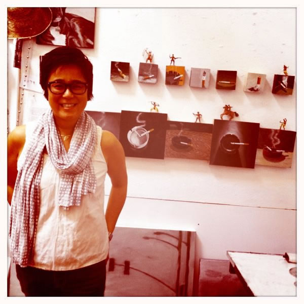
DUNE WORM "4x 4" oil on panel

I added the smoke to these cigarette paintings a couple of days after they had dried.  Generally, I don’t like to work paint after it’s dry.  I like to work at different stages of wet, but this is one exception.  I want the background to show through the smoke and be dry enough to remain intact, even if I have to wipe it out and start over, or manipulate the smoky tendrils without disturbing the painting underneath.  Straight white paint on top of things can be very tricky, as my beginning painting teacher told me, back a million years ago in college.  He said, “Straight white is a very effective highlight, but if you are not careful it can look like bird shit on everything.”
VACATION 8"x 10" oil on panel

I used some straight Flake White oil paint, applied with a hundred year old brush that has bristles that have fallen out from all the scrubby action it has seen and from many exhausting cleanings.  The hairs are sparse and curling.  Most people would probably throw out a brush at that stage, but I keep it.  Sometimes I will trim them and make a really pointy brush, or sometimes they will become my favorite coveted “one hair” brushes!  I call them “one hair” but they are really about three hairs.  You need that many to really support paint in a respectable manner.  “One hair” brushes are rare because the hairs remain straight, when most would curl, and the hairs are clumped together in a point, not sparse and patchy.  The “one hair” brushes are rare and wonderful and naturally they don’t last long and soon become no-hair brushes.  At that point they are used for stirring and poking.
Anyway, I digress…  Next I “oil up” the surface of the painting with a viscous solvent, and use a regular old brush to create nice separate, scratchy lines at an uneven pressure so that some are clear and white and some are indistinct and hopefully “smoky”.  The “oiling up” of the surface first makes some of the thinner lines blur like smoke and melt into the surface of the painting and not set up like bird doo doo.  This wet into wet technique is similar to a water color technique I used to love to use because it wasn’t so controlled.  You pretty much let the paint “paint itself”.  You wet the area you want painted with some clean water, then drop your color or colors into it in any manner you want.  I got some great swirling skies.  Watercolor was the first painting medium I got into in depth.  When I applied for graduate school at the San Francisco Art Institute (SFAI) my portfolio was half watercolor and half acrylic.  (I tried acrylic for a year).  Seems crazy but SFAI took me, even though I told them I was going to start oil painting.  It isn’t recommended to start a new medium when starting graduate school, although many switch to performance or video while they are there.  Anyway, watercolor is the most technical form of painting and you have to think ahead a lot and plan with “reserved whites” and all, so I liked this technique because it allows some spontaneity.  
COUPLE'S THERAPY 8"x 8" oil on panel

After the smoke dries, I layered a glaze in certain spots on top of the smoke to integrate it into the background.  I used a little Galkyd, for the first time, mixed with a touch of some transparent paint colors like Alizarin Crimson and Prussian Blue, with a little Raw Umber (which is not so transparent but it tones down the purple of the crimson and blue mix).  I find the Galkyd a little shiny for my tastes, but it does make the colors sing, a lot like wetting a stone.  I also like how the glaze settles in the groovy texture of the dried paint and leaves all this color without changing the overall color or value.
LAST ONE 10"x 10" oil on panel


Back in Black is the Song


This painting was a fun one.  It had a limited palette, my favorite.  It has great space and light in it.  No smoke, I think this is a no smoke cigarette. 
I started with the background, the dense darkness shot with shafts of white.  I used a lot of Galkyd solvent, so it had very few brush strokes, but I sanded it the next day anyway.  The Galkyd really speeded up the drying time and it was bone dry the next day.  The sanding made the surface extra smooth and left some interesting scratches.  I drew the ashtray and cigarette in with a little Raw Umber, then started fleshing out the ashtray. 

I added more whites back into the table that got lost from the sanding. I started blocking in the darker values in the cigarette and added the blue and all the reflections to the ashtray.
IT'S A STAGE 10"x10" oil on pane I like the simplicity of the composition and the drama and space created by the lighting.  I think most of all, I like the idea of painting a black object on a black background. Black on Black, was that a Areosmith song?  


Wednesday, September 7, 2011

Size Matters

 
TANKER oil on canvas 36"x36" Initial sketch in Raw Umber and a wash of Gamsol and Umber
TANKER detail

When I originally thought of doing my “Highway 5” series I imagined large paintings, 30 inches and up.  30 inches and larger is HUGE for me.  I can do cigarette paintings at 4”x4” up to 10”x10” all day long and I am having giggling fun.  Larger paintings make me more anxious.  It is a big commitment.  First of all the larger size canvas or panel is considerably more expensive, not to mention that it will take at least 10 times the paint to cover it.  Plus, you know how I like to paint…thickish.  When I was at SFAI one of my favorite painting advisers was Franklin Williams, he was both philosophical and witty, my favorite combination.  He told this story about how most people in their first painting class, would want to do two things.  First, they want to do a BIG painting; second, they want to do a RED painting.  So the first thing he had them do, so he said, (thinking back, I think he just told them the story like he was telling us the story) was stretch a huge canvas, somewhere around 40”x 60” and he would let them all paint on it for couple of weeks.  They would struggle and curse that monolithic surface, until they got the BIG painting out of their system.  Franklin would then talk about the importance of finding your scale, be it Indian miniature size or a mural.  By the way, after this little exercise most people forgot they wanted to do the RED painting and just worked on space, line, form, color, content and all the other stuff that could take up all your time in gooey paint.  Anyway, I did my share of largish paintings and a lot of small paintings.  However, I really envisioned Highway 5 big.  The large scale naturally goes with the largeness of the space, so when I recently got some large canvases on sale I decided to do, “Tanker” in the format it deserved. 36”x36”.  Here is the beginning… It is really making me want to go on a road trip!!!

Bad start on the body of the tanker.  I wiped it out and started again.
Day 2.  I added a darker wash to the road and worked on the different planes of the truck.  The tank itself started looking "quilted" so I lowered the contrast. 

Monday, September 5, 2011

Great Highway


GREAT HIGHWAY sketch


I love the name, “Great Highway”.  It is such picturesque and romantic name and it is a “great highway”.  So, here I go with another painting of the city heading toward abstraction.  It is quite large for me, the same size as “45th Avenue”, 30”x 40”.  I am starting out with thinner paint, in an effort to avoid old dried paint that creates unrelated bumps and brushstrokes in the finished surface.  So I am going to try painting thinner, at least in the beginning.  In “45th Avenue” I put a thick layer of paint down relatively early on and it was a considerable problem that affected the three consecutive layers of paint that finally made up the sky.  I figured I had maybe three methods I could use to keep painting on top of the heavy texture and still keep it fresh.  First, I could apply the new paint strokes in the same direction as the old paint strokes.  Second, I could use a power sander and sand the bumps down first.  Or third and my personal favorite, I could just apply a s--t load of new paint on top and use a palette knife to spackle over the old grooves.  I used the first and the third techniques and I am pleased with the results.  The painting has gained a nice heavy quality, my homage to Jay Defeo , who was not afraid to throw some paint.  Her painting "The Rose" ended up weighing 3,000 pounds.
Jay Defeo painting "The Rose"

"The Rose" detail
Back to the Great Highway, I want the “sky” to be vast and smooth.  The light posts and signals thin and barely there, like something that is gazed at through a long distance, a tunnel of air which wavers and disappears.  It is not easy to paint air.  The real question is can I paint air abstractly, or will my ambivalence finally get the best of me and I will have to choose?  Well that is my dilemma and intent.  We will see. 

day two

Thursday, September 1, 2011

PAINTING DRAMA part 5

Whoops, traffic signal only has 2 lights. 
The end is near.  I can taste it.  I think there is about $50 worth of paint on it right now.  
 I think the letters that make up "45th Avenue" are too big.  But I think I am almost there.